![[BEYOND TV SAFETY]](/file/35716/EX CD Rom.iso/issue2_7/images/section_tvsafety.gif)
 |
How to tell good art from bad (continued)
Some thoughts on detail
One of the most common problems I see with American fan art or art of any
sort for that matter is that there is too much attention paid to detail
(or effects) and not enough to the base concept. I've seen countless
comics, both amateur and professional, that have guns detailed down the
last screw and lots of impressive coloring work but the characters are
malformed and they are in poses that are ridiculous. Space suits (no hands,
no feet) with highly realistic reflections and the background is on a
completely different perspective plane. Normal sized superheroes that,
seen in 3D space, are actually 20 feet taller than the buildings they are
by (Or Klingon battle cruisers that have incredible detail put into the
warp nacelles that are aimed 30 degrees to the left of where the bridge
thingee is). This is the equivalent of putting a beautifully patterned
bikini on a Morlock (TIME MACHINE), standing it on
a garbage covered beach and thinking that the image is good because the
detail is pretty.
Lines
|
Any work that aspires, however humbly, to the
condition of art should carry its justification in every line.
—Joseph Conrad |
Manga, comics and animation are all based on the lines. Bad lines will
mean a bad image.
The best advice I can give to artists working with pens is: get
rid of the technical pens! There is no variation in any of the lines
(the whole point of using a tech pen) and this kills the dynamic feeling that
should be there. They also make shaky, wiggly lines in the hands of an amateur.
(Look at the image we're using here!)
Animation and manga lines have kyoujaku: thick/thinness
or what western animators call line quality. The most common line
styles, most easily identifiable from their endings (or where they join other
lines), we use are these:
 |
The three on the left are lines commonly used in characters. The
others are used for machines and props. |
 |
This is an example of varying line widths. I've thickened the
lines in spots where things overlap or attach so that they stand apart
better. The slight variance gives everything more volume and it
doesn't look like it's all on the same plane. This is just a sketch
and my lines are still pretty shaky but the basic idea is there. |
If you're working on a computer, spend the money and buy a tablet. That it
makes painting easier than a mouse is a secondary concern. The most important
thing is that you can use the pressure sensitivity as you would use varying
pressure on a pencil or brush. Use those differences!
One of the most common signs of an amateur artist is sketchy or
"hairy" lines. It makes the outline harder to make out and ruins
the clean look of the image. Try to work with longer and fewer lines.
Every single line on a finished image should have meaning. A sketch is a
different matter and as long as the artist knows what he wants to do and
the sketch can help him accomplish that pretty much anything is OK. This
sort of sketch should be kept private though.
Correctly applied, cross-hatching can be a very nice effect.
Here we have a very poor example. The artist here would have been
better off buying some screen tone or just leaving the image the
way it was. These lines will probably not appear or will look like
dirty spots on a reduced size photocopy.
There are many great examples of cross-hatching and other line work out there.
(One of my absolute favorites is the work Berni Wrightson did for the
illustrated FRANKENSTEIN book. Check out the ones he
did for CYCLE OF THE WEREWOLF too.)
Likewise, the artist should not try to color in large areas with
pencil or to put some pencil down and smear it with a finger or smudge stick.
That's OK for pastels but looks terrible and doesn't reproduce well with
graphite pencil.
Problems
|
Art, like Nature, has her monsters, things of bestial
shape and with hideous voices.
—Oscar Wilde |
Common problems with fan art are heads, eyes and hands. In the image here we
can see that the characters' heads are somehow strangely shaped but that can
be said about many anime characters. The artist must always keep in
mind the basic construction elements of the characters. In this case
the artist does not have a clear idea of what the actual shape of the
characters' heads are under all that hair.
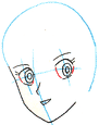 |
Here is Patty's head as an example. You can see that her eyes
are not lined up correctly for the curve and angle of her face. The
blue line approximates her actual head shape. |
A character should always be conceived of from the most inner,
basic elements outward. Think of what the skeleton looks like then what the
unclothed body looks like (Kya!). Think of what the clothes are made
of and how the different layers cover each other. Think about the texture of
each item—the smooth or rough leather, the weave of the cloth, the silky
hair, the gooey, slimy tentacles, the cold metal or whatever else you may have.
When you can feel each object as you are drawing it then you will make a much
better image.
As mentioned before, eyes are always a problem. Anime characters
often have large expressive eyes and it is easy to make large, obvious
mistakes. When drawing eyes, the artist should think of what the eyeballs
looks like inside the head and where they are looking. The positions of both
upper and lower eyelids are very important as they can communicate the
character's emotion.
The artist here has not considered what the eyeballs look like
and did not think about drawing the rim of the eye on the original sketch
so the eyes are out of place.
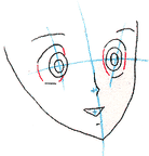 |
This is Rabby's original face structure. Not only are the features
out of line but the eyes are misshapen and aimed wrong. Adding in the red
borders of the eyeball/eyelids really makes a difference! |
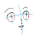 |
This the the corrected face structure, You can see that the
facial features are all oriented the same way. |
 |
This is a detailed version of Rabby's corrected eye. |
I like to put a heavy line around the colored part of the eye
to make it stand out even more and make the eyes more visible. Here, I'm
working with characters that were designed by someone else and I want to
keep as much as possible to their design but I can still vary the line weight
in spots to get a better effect.
It has been said that the single greatest indicator of emotion
is the eyebrow and this may be true of anime characters. A slight change
in angle can mean the difference between total acceptance and caution or
hesitation.
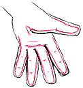 |
Rabby's hand is pretty deformed here, almost simian. Here is
what her hand should look like. The red line indicates her actual
finger shape under her gloves. |
There is no magic way to draw perfect hands and hands are about as complex
as the human body gets. There are lots of good pose books that have images
of hands and the artist can also take a Polaroid or a digital snapshot of
his or her hand in the right pose. It may take a long time to draw the hands
but that effort is not wasted – the human hand is extremely expressive
and drawing it poorly or not spending enough time on it expresses the
artist's lack of concentration and quality. The same can be said about feet.
I see a lot of fan art with characters that have no hands or feet.

|
|